
We often like to believe that people judge products, brands, and experiences purely on substance. In reality, the first judgment almost always happens before logic kicks in and that judgment is visual.
Whether it’s a website, an app, a CV, a product page, or a brand campaign, visuals silently communicate quality long before words are read or features are explored. In this blog, we’ll break down how visuals shape perceived quality, why this happens psychologically, and how brands can use visual consistency to build trust, value, and credibility, especially in digital spaces.
The Psychology Behind Visual Cues and Product Value
Humans are wired to process visuals first. Studies in cognitive psychology consistently show that the brain processes visual information significantly faster than text. This means that before someone understands what you’re offering, they already feel something about it.
That feeling becomes a shortcut for quality.
Why visuals influence judgment so strongly
When users encounter a product or brand visually, they subconsciously ask:
- Does this look professional?
- Does this feel trustworthy?
- Does this look intentional or rushed?
- Does this seem premium or average?
These questions are answered almost instantly, often without conscious awareness. Visual cues such as layout, spacing, color harmony, typography, and alignment act as signals. When those signals are strong and coherent, people assume the underlying product or service is high quality. When they are weak or inconsistent, doubt creeps in even if the actual offering is solid.
In simple terms:
Good visuals reduce uncertainty. Poor visuals increase skepticism.
Lighting, Texture, and Color Consistency Across Platforms
Visual quality isn’t just about “looking good.” It’s about coherence.
Lighting and clarity
In photography, product imagery, or even UI screenshots, lighting plays a critical role. Well-lit visuals suggest transparency and confidence. Dark, uneven, or unclear visuals often signal low effort or lack of polish.
For digital products and brands, this translates into:
- Clear contrast between text and background
- Proper spacing that avoids clutter
- Visual hierarchy that guides the eye naturally
When everything feels readable and breathable, users perceive higher quality.
Texture and depth
Subtle use of depth, shadows, and texture can elevate how a brand feels. Flat isn’t bad. But thoughtfully flat is very different from accidentally flat.
Well-used textures or depth cues suggest:
- Attention to detail
- Design intention
- Professional execution
Overuse, however, can feel noisy and distracting. Balance matters.
Color consistency
Color is one of the strongest trust signals in visual perception.
When brands use:
- Too many colors
- Inconsistent shades
- Poor contrast
…it creates visual fatigue and confusion.
Consistent color systems, on the other hand:
- Improve recognition
- Create emotional stability
- Make brands feel reliable
Across websites, apps, social media, and marketing materials, color consistency reinforces perceived quality even when users don’t consciously notice it.
How Brand Visuals Impact Pricing Perception
One of the most interesting effects of visuals is how directly they influence what people think something is worth.
Two products can offer the same functionality, yet the one with stronger visuals almost always feels more valuable.
Visuals shape perceived value before price is even seen
People subconsciously associate:
- Clean design = premium
- Cluttered design = budget or low quality
This is why brands with refined visual identities can:
- Charge more
- Face less resistance to pricing
- Build trust faster
Even in service-based businesses, visuals play a massive role. A polished website, clear layouts, and consistent branding often justify higher pricing in the customer’s mind, without a single word explaining why.
This applies to careers too
The same principle applies beyond products.
For example:
- A clean, well-structured CV feels more credible than a cluttered one
- A clear, well-formatted cover letter feels more thoughtful
- A consistent professional profile feels more trustworthy
Visual quality influences how competence is perceived, even when qualifications are identical.
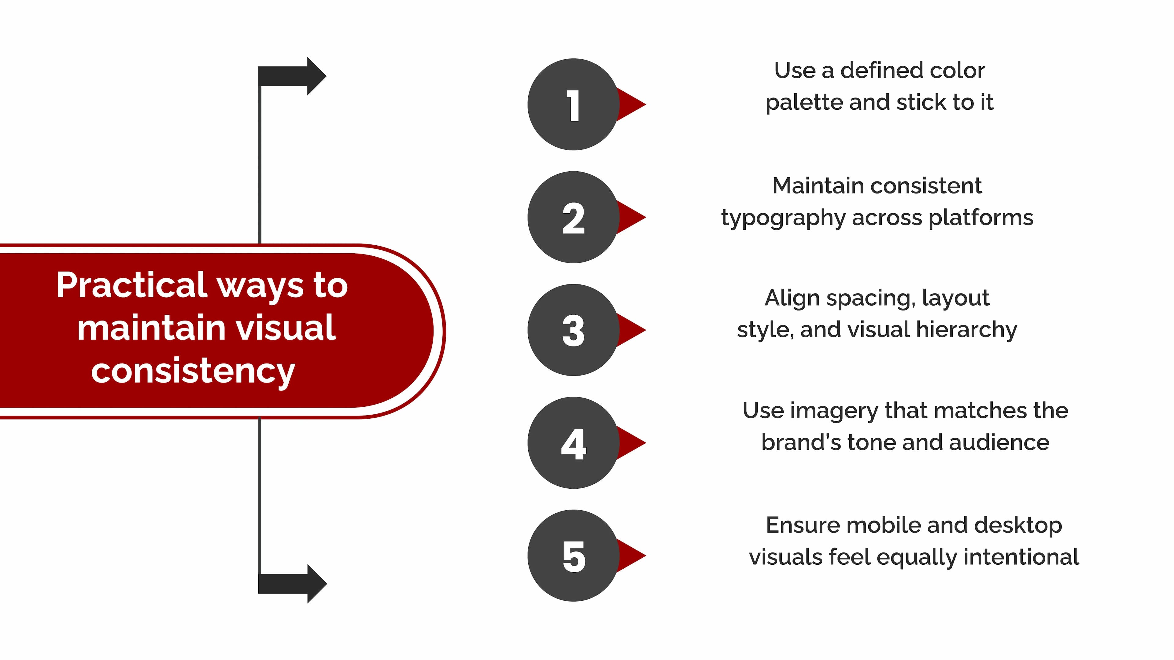
Applying Visual Consistency in Digital Marketing
In digital marketing, visuals are not decoration. They are communication.
Why consistency matters more than creativity
Creativity attracts attention, but consistency builds trust.
When users encounter your brand across:
- Ads
- Landing pages
- Emails
- Social media
- Websites
…and everything feels visually aligned, it creates a sense of reliability.
Inconsistent visuals, on the other hand, force users to re-evaluate the brand every time which increases friction and doubt.
Why Visual Quality Matters More in Digital-First Experiences
As more interactions move online, visuals become the primary signal of effort and credibility.
When users can’t:
- Touch a product
- Speak to a person
- Experience something physically
They rely heavily on how things look to decide how they feel.
This is why digital products, career platforms, SaaS tools, and online services must prioritize visual clarity just as much as functionality.
A great product with poor visuals struggles to earn trust. A well-presented product earns attention faster.
The Emotional Side of Visual Perception
Beyond logic and trust, visuals also shape emotion.
Good visuals can make users feel:
- Calm instead of overwhelmed
- Confident instead of unsure
- Guided instead of lost
These emotional responses influence decisions more than we consciously admit.
When users feel comfortable navigating something visually, they are more likely to:
- Stay longer
- Explore deeper
- Take action
That’s why visual quality directly impacts conversions, engagement, and loyalty.
Conclusion: Visuals Are Not Optional
Visuals don’t just make things look better. They make things feel more reliable, valuable, and intentional.
In a crowded digital world, where attention is limited and choices are endless, visual clarity becomes a competitive advantage.
When visuals communicate effort, consistency, and care, people assume the same qualities exist beneath the surface.
At Seven Koncepts, we believe visuals are not just design elements, they are strategic tools that shape perception, trust, and value. If you’re building a digital product, brand, or platform and want visuals that communicate quality from the first glance, we’re here to help.
Discover how our branding services can transform your business today
FAQs
1. Why do visuals affect perceived quality so strongly?
Because the brain processes visuals faster than text, people form opinions based on appearance before evaluating substance.
2. Can good visuals compensate for weaker content?
They can create initial trust, but long-term credibility still depends on substance. Visuals open the door; quality content keeps people inside.
3. Does visual consistency really matter across platforms?
Yes. Consistency reduces cognitive load and builds recognition, making brands feel more trustworthy and professional.
4. How do visuals influence pricing perception?
Premium visuals often justify higher prices by signaling quality, effort, and professionalism before value is consciously evaluated.
5. Is visual quality important for personal branding too?
Absolutely. CVs, portfolios, LinkedIn profiles, and cover letters are all judged visually before being read in detail.