
Visual hierarchy is storytelling- just without words. In a world where users scan before they read and decide before they think, the way we structure visuals determines whether a message lands or gets lost. In 2026, storytelling through visual hierarchy isn’t a design trend; it’s a core digital marketing strategy. Layout, spacing, contrast, and alignment quietly guide users through an experience, shaping emotions, comprehension, and decisions at every step.
When done right, visual hierarchy doesn’t feel like design; it feels like intuition.
What Is Visual Hierarchy (And Why It’s a Storytelling Tool)
Visual hierarchy is the intentional arrangement of elements to show users:
- What to look at first
- What matters most
- What comes next
But here’s the key: hierarchy isn’t just about order; it’s about narrative. Every website, landing page, or app tells a story. The question is whether that story is clear, compelling, and easy to follow. As designers and marketers, we don’t just present information; we guide attention and emotion.
In branding, web design, and UX/UI services, visual hierarchy is the invisible framework that turns chaos into clarity.
How Layout Guides Emotional Flow
Layout is the foundation of visual storytelling. Before colours, fonts, or imagery come into play, layout sets the emotional tone.
Think of layout as pacing in a story:
- Dense layouts feel intense and urgent
- Open layouts feel calm and confident
- Structured layouts feel reliable and professional
In digital marketing, emotional flow matters because emotions drive behavior. A cluttered layout can create anxiety. A clear layout builds trust.
How layout shapes emotion:
- Top-heavy layouts signal importance and authority
- Z-patterns and F-patterns align with natural reading behavior
- Progressive layouts create anticipation and momentum
When we design layouts, we’re not just organizing content, we’re deciding how users feel at each stage of their journey.
Using Contrast to Create Focus and Drama
Contrast is one of the most powerful storytelling tools in design. It’s how we say, “This matters. Pay attention.”
Contrast can be created through:
- Size (large vs small elements)
- Color (light vs dark)
- Typography (bold vs regular)
- Shape (sharp vs soft)
In conversion-focused web design, contrast is often what separates a passive page from an active one.
Why contrast works:
- It reduces decision fatigue
- It creates visual pauses
- It directs attention without forcing it
A strong headline contrasted against subtle body text feels intentional. A CTA button that clearly stands apart feels like the next logical step in the story.
Contrast creates emphasis, but it also creates rhythm.
The Power of Space: Letting the Story Breathe
Whitespace (or negative space) is often misunderstood as “empty” space. In reality, it’s one of the most effective storytelling tools available.
Space:
- Improves readability
- Creates focus
- Signals confidence
- Reduces cognitive overload
In brand and web design services, whitespace is what allows important elements to stand out without shouting.
How space supports storytelling:
- It separates chapters in your narrative
- It slows users down at key moments
- It makes content feel premium and intentional
Designs that lack space feel rushed. Designs that embrace space feel thoughtful.
Alignment: The Quiet Enforcer of Trust
Alignment doesn’t scream for attention, but users notice when it’s wrong.
Proper alignment:
- Creates visual order
- Improves comprehension
- Builds subconscious trust
When elements align, the story feels cohesive. When they don’t, users feel friction even if they can’t explain why.
In UX/UI design, alignment helps users predict where information will appear next. That predictability is comforting, and comfort keeps users engaged.
Applying Narrative Arcs in Design
Every good story has a structure:
- A beginning (introduction)
- A middle (development)
- An end (resolution)
The same applies to visual storytelling.
Beginning: The Hook
This is where visual hierarchy must immediately establish:
- Who this is for
- What it’s about
- Why it matters
Strong headlines, hero imagery, and clear visual dominance play a key role here.
Middle: The Build
This is where we deepen understanding:
- Supporting information
- Social proof
- Benefits and features
Hierarchy here should feel smooth and logical, guiding users step-by-step without overwhelming them.
End: The Resolution
This is where action happens:
- CTA buttons
- Forms
- Next steps
The visual hierarchy at this stage should feel inevitable like the natural conclusion of the story.
This narrative-driven approach is at the heart of effective brand marketing and conversion optimization.
Visual Storytelling in Branding and Identity
Visual hierarchy isn’t just for websites; it’s a core part of brand identity design.
Strong brands use hierarchy to:
- Establish recognition
- Communicate values
- Maintain consistency across platforms
From social media creatives to pitch decks, hierarchy ensures that the brand story stays clear across every format.
This consistency is what turns exposure into brand recall and recall into trust.
Testing User Comprehension Visually
One of the most overlooked aspects of design is testing- not functionality, but comprehension.
We often ask:
- Can users navigate this? But the better question is:
- Do users understand this without effort?
Ways to test visual comprehension:
- Heatmaps to see where users focus
- Scroll depth analysis
- A/B testing layouts and hierarchy
- Observing where users hesitate or drop off
If users miss key messages, the hierarchy isn’t doing its job.
In performance-driven design services, testing hierarchy is just as important as testing copy or CTAs.
Why Visual Hierarchy Matters for SEO and UX
Search engines increasingly reward good user experience. Clear hierarchy improves:
- Time on page
- Readability
- Content scannability
Using headings properly, structuring content logically, and guiding attention all contribute to better SEO performance.
Good hierarchy helps both humans and algorithms understand what’s important.
Common Mistakes That Break Visual Storytelling
Even strong brands can weaken their story through poor hierarchy. Common issues include:
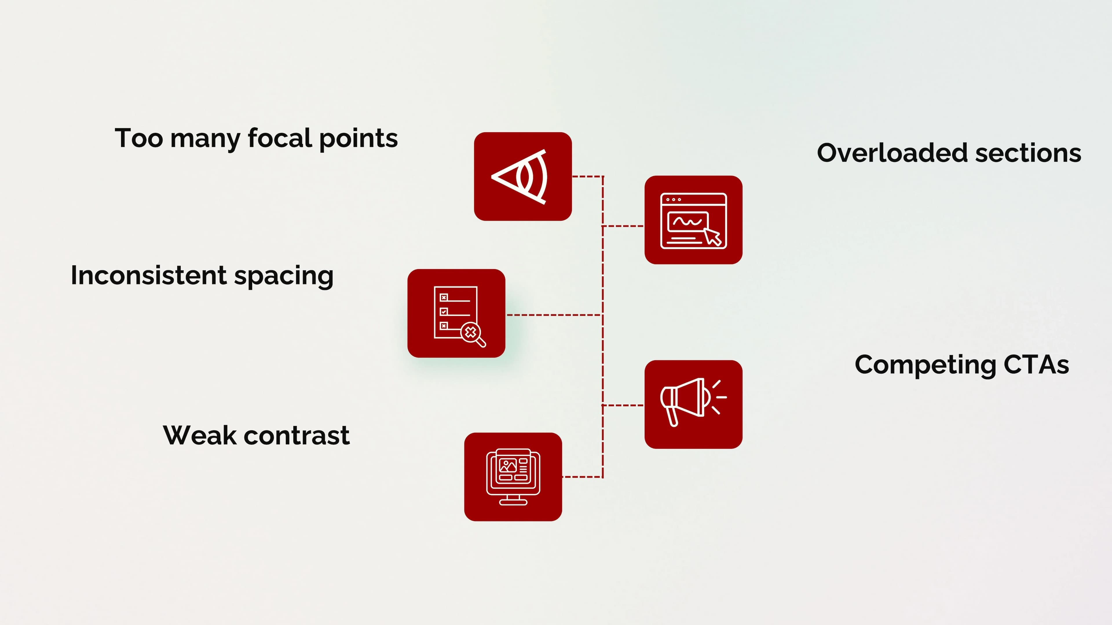
When everything tries to be important, nothing feels important.
Good storytelling is about restraint as much as emphasis.
Visual Hierarchy Is Strategy, Not Decoration
Design that tells a story doesn’t happen by accident. It’s the result of intentional decisions rooted in psychology, marketing goals, and user behavior.
When visual hierarchy is done well:
- Users feel guided, not sold to
- Information feels clear, not overwhelming
- Action feels natural, not forced
That’s the difference between design that looks good and design that works.
Conclusion
Storytelling through visual hierarchy is about respect; respect for the user’s time, attention, and intelligence.
In a digital world overflowing with content, the brands that win are the ones that communicate clearly and emotionally at the same time. Layout, contrast, space, and alignment aren’t just design tools, they’re narrative devices.
When we use them intentionally, we don’t just tell stories; we create experiences people remember.
Ready to Tell Your Brand’s Story Visually?
At Seven Koncepts, we design experiences that guide, engage, and convert. From brand identity design to UX/UI and web design services, we use visual hierarchy to turn complex messages into clear, compelling stories.
Let’s design a story your audience can feel and follow.
FAQs
1. What is visual hierarchy in design?
Visual hierarchy is the arrangement of elements to guide attention and communicate importance.
2. How does visual hierarchy affect user behavior?
It influences where users look, what they read, and what actions they take.
3. Why is whitespace important in storytelling?
Whitespace improves clarity, focus, and emotional pacing.
4. Can visual hierarchy improve conversions?
Yes. Clear hierarchy reduces friction and makes decision-making easier.
5. Is visual hierarchy important for SEO?
Absolutely. Proper structure improves readability, engagement, and search performance.