
Visual consistency in social media campaigns is not just about making your posts look good. It makes your brand recognizable, trustworthy, and memorable across every platform. Users scroll in seconds. Consistency makes them pause and recognize you instantly.
We often see brands investing heavily in content creation, paid ads, and influencer collaborations. But when you look closely, their visuals feel disconnected. Colors change. Fonts vary. Tone drops. Every post feels like a differnt brand. And the brand quietly disappears from memory.
Let’s talk about why visual consistency matters and how we can build it strategically.
What Is Visual Consistency in Social Media?
Visual consistency means maintaining a unified look and feel across all your social media posts and campaigns.
It includes:
- Consistent colour palette
- Defined typography
- Repeated layout structure
- Recognizable graphic elements
- Cohesive photography style
- Aligned tone of visuals and messaging
When done correctly, your audience should be able to recognize your content even before seeing your logo.
Consistency builds familiarity. Familiarity builds trust. And trust drives everything else.
Why Visual Consistency Impacts Campaign Performance
Many brands underestimate the psychological impact of visual repetition. Repeated colours, fonts, and design patterns, train thebrain to recognize your brand automatically. This strengthens recall and builds brand equity over time.
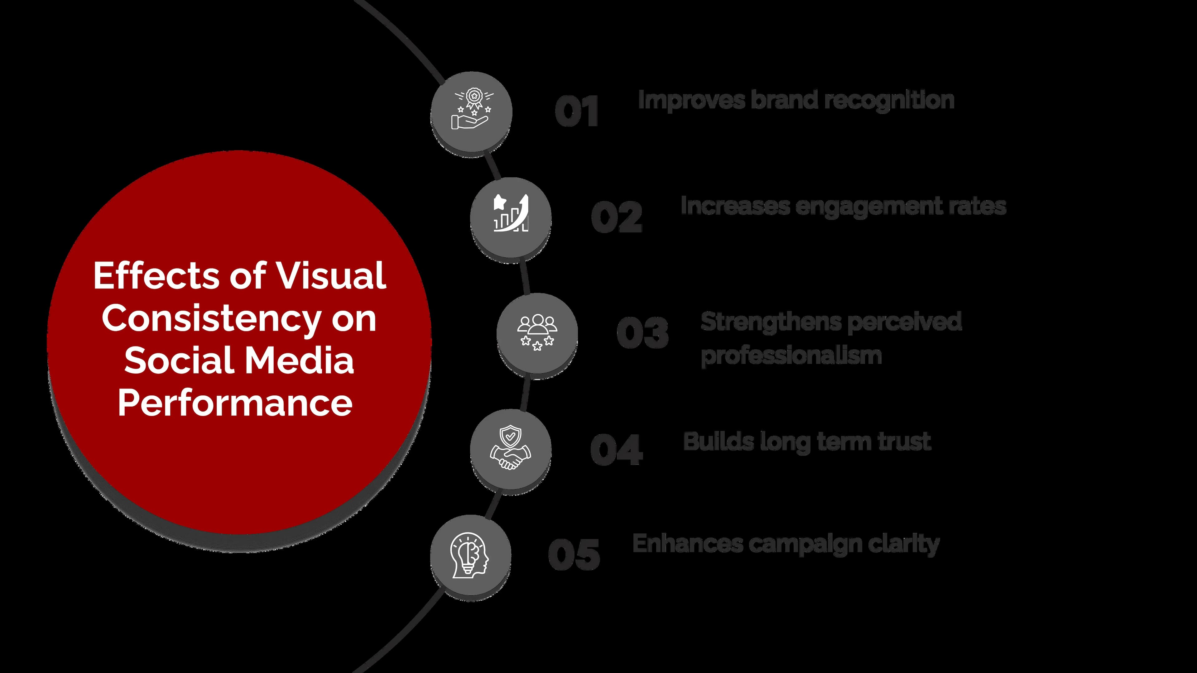
Change your visuals every campaign and your audience has to start over. Every. Single. Time. Consistency reduces friction.
The Role of Brand Guidelines in Social Media Campaigns
Visual consistency does not happen by accident. It comes from clear brand guidelines.
Brand guidelines define:
- Primary and secondary colors
- Typography hierarchy
- Logo usage rules
- Image treatment style
- Graphic patterns and elements
- Spacing and alignment standards
At Seven Koncepts, every campaign starts with the brand system. Non-negotiable.
Without this structure, teams improvise,and improvisation often leads to inconsistency.
Consistency Does Not Mean Boring
People assume consistency kills creativity. It doesn't. Consistency creates structure. Creativity happens within that structure.
For example:
- You can experiment with messaging while maintaining the same layout
- You can rotate themes while keeping your color palette intact
- You can create multiple campaign concepts using the same visual grid
Think of it like architecture. The foundation stays the same while the interior revolves. The goal is to maintain recognition while allowing creative variation.
Key Elements That Ensure Visual Consistency
To build visual consistency across social media campaigns, we focus on several core elements.
1. Color Discipline
Using random colours weakens brand identity. Choose a defined palette and stick to it. Even seasonal campaigns should feel connected to your core colour system.
Consistency in colour builds instant visual recall.
2. Typography Control
Your font choice says something before your words do. Using too many fonts creates visual chaos. Limiting typography to two or three defined styles ensures visual clarity and professionalism.
Headlines, subheadings, and captions should follow a predictable hierarchy.
3. Layout System
Build reusable templates. They save time and protect consistency.
A defined layout might include:
- Fixed logo placement
- Structured headline area
- Consistent margin spacing
- Repeatable graphic frames
Templates reduce guesswork and improve efficiency for your team.
4. Image and Photography Style
Your image treatment should feel unified.
For example:
- Bright and minimal
- Moody and dramatic
- Corporate and clean
- Vibrant and youthful
Switching photography styles frequently confuses the audience. Select a direction and maintain it.
5. Tone Alignment
Visuals and messaging must match.
A playful visual style with overly formal copy creates inconsistency. Your audience will feel the disconnect even if they can't explain why. Your tone of voice should align with your visual identity.
The Challenge of Multi Platform Campaigns
Brands today operate across multiple platforms, such as Instagram, LinkedIn, Facebook, and TikTok. Each platform has its own format requirements and audience behavior. Your brand identity shouldn't change because of them.
We approach this by:
- Designing flexible templates that adjust to size variations
- Maintaining core design elements across formats
- Adapting the layout without changing brand identity
The platform may change. The brand should not.
Common Mistakes That Break Visual Consistency
We often see brands unintentionally damaging their visual identity.
Some common mistakes include:
- Using different logo versions randomly
- Changing color shades frequently
- Overusing trending design styles
- Ignoring typography hierarchy
- Allowing multiple team members to design without guidelines
These small inconsistencies accumulate and gradually weaken the brand. Consistency requires discipline.
How We Build Consistent Campaign Systems
At Seven Koncepts, we treat social media campaigns as structured systems rather than isolated posts.
Our approach includes:
- Developing campaign specific visual kits
- Creating master templates for recurring content
- Defining grid structures for feed harmony
- Aligning messaging tone with visual themes
- Auditing visual consistency before launch
This ensures every campaign feels cohesive, professional, and strategically aligned. Visual consistency is not about limiting creativity. It is about protecting brand equity.
The Long Term Impact of Consistency
When a brand maintains visual consistency over time, something powerful happens. Recognition becomes automatic. Trust increases. Engagement stabilizes.
Your audience begins to associate your visual identity with reliability and value. In competitive digital environments, this recognition is a major advantage.
Visual consistency transforms social media from random posting into strategic brand building.
Conclusion
Social media is fast paced and crowded. Brands that appear scattered struggle to build lasting impressions.
Visual consistency creates structure, familiarity, and credibility. It turns campaigns into cohesive brand experiences rather than isolated content pieces. If we want campaigns to drive long term impact, we must treat visual identity as a strategic asset, not just a design choice.
Consistency is not about repetition. It is about recognition. And recognition is what keeps your brand top of mind.
Ready to Strengthen Your Social Media Presence?
At Seven Koncepts, we design strategic social media campaigns built on strong visual systems. We help brands create cohesive identities that scale across platforms while maintaining clarity and impact.
If you are ready to build campaigns that look professional, feel consistent, and drive measurable engagement, connect with Seven Koncepts today. Let us turn your social presence into a powerful brand asset.
FAQs
1. Why is visual consistency important in social media campaigns?
Visual consistency improves brand recognition, builds trust, and creates a professional appearance. It helps audiences instantly identify your content in crowded feeds.
2. Does visual consistency limit creativity?
No. Consistency provides structure. Creativity happens within that structure. It ensures innovation does not compromise brand identity.
3. How can small businesses maintain visual consistency?
By creating simple brand guidelines, using templates, defining a color palette, and limiting typography choices. Even basic structure makes a significant difference.
4. Should visuals be identical across all platforms?
Not identical, but aligned. The design should adapt to platform requirements while maintaining core brand elements such as color, typography, and tone.
5. How often should brand visuals be updated?
Brand visuals should evolve gradually, not change abruptly. Major rebrands should be strategic, while small updates can be introduced carefully without losing recognition.