
Micro-interactions are the tiny design moments that make a product feel alive. If you’ve ever tapped a button and felt a satisfying response, watched a form field gently guide you, or noticed a smooth “Saved” confirmation that instantly reduced your stress, that was a micro-interaction doing its job. These details might look small on the surface, but in real life they shape trust, clarity, and conversions. In modern interactive design, micro-interactions are often the difference between “this feels premium” and “this feels broken.”
In this blog, we’re going to break micro-interactions down in a practical, human way; what they are, why they matter, how motion design and motion graphics can amplify them, and how we (as designers and product teams) can use them to create smoother, more high-performing experiences.
What Are Micro-Interactions in UI/UX?
A micro-interaction is a single-purpose design response that happens when a user does something (or when the system needs to communicate something).
Think of it like a quick conversation between the product and the user:
- User: “I clicked this.”
- Product: “Got it. Here’s what happened.”
Micro-interactions usually show up in places where users need reassurance, direction, or feedback, especially in moments that can cause doubt. And doubt is expensive. Doubt creates hesitation, rage clicks, drop-offs, and support tickets.
Everyday micro-interaction examples (that we all notice without realizing it)
Micro-interactions are everywhere, including:
- A button that subtly compresses on tap
- A “password strength” meter that updates in real time
- A heart icon that animates when you like something
- A toggle that slides smoothly instead of snapping
- A skeleton loading screen that reduces frustration while waiting
- A “Copied!” tooltip after you copy text
They’re small, but they create the feeling that the product is responsive, reliable, and thoughtfully built.
Why Micro-Interactions Matter (More Than We Think)
We don’t experience digital products purely through logic. We experience them emotionally too, through speed, feedback, and flow. Micro-interactions shape that emotional experience.
Here’s what strong micro-interactions help us achieve:
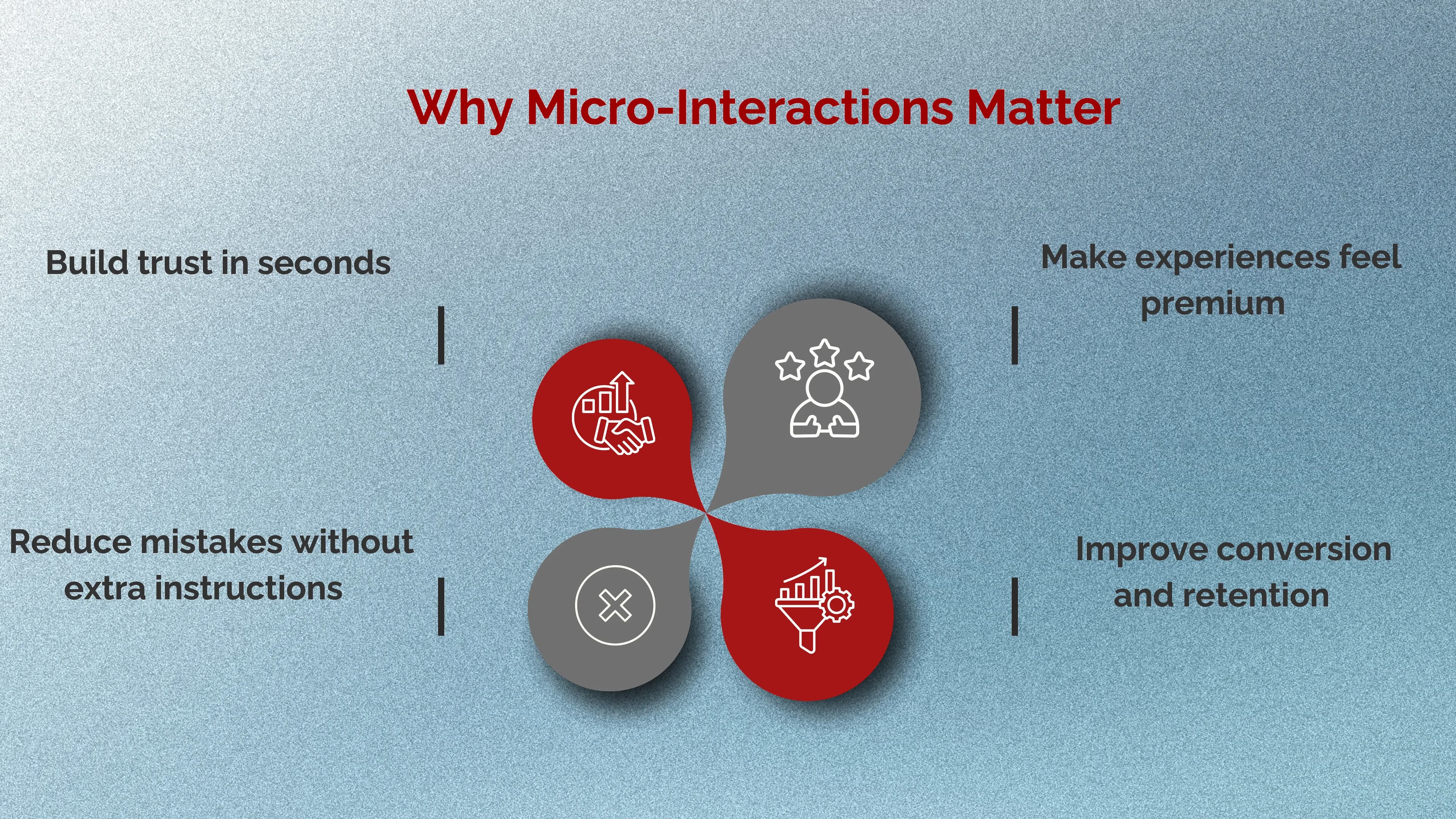
1. They Build Trust in Seconds
When someone taps something and nothing happens, the brain assumes:
- “Did it work?”
- “Is the site slow?”
- “Do I tap again?”
- “Is this safe?”
Even a tiny response, a hover state, a micro animation, a spinner, a success check removes that uncertainty. Trust increases, friction decreases.
2. They Reduce Mistakes Without Extra Instructions
The best products don’t need long paragraphs explaining how to use them. Micro-interactions guide users silently:
- highlighting the next step
- showing what’s clickable
- preventing errors before they happen
- confirming actions clearly
3. They Make Experiences Feel Premium
You can have a decent layout and good colours, but if the interface feels stiff, the whole product can still feel “cheap.” Great motion design makes the experience feel intentional and polished, like the difference between a basic door and a soft-close luxury door.
4. They Improve Conversion and Retention
Micro-interactions help users move forward confidently. That matters most in high-drop-off areas like:
- sign-up forms
- checkout flows
- onboarding steps
- pricing pages
- “contact us” submissions
When the interface communicates well, users don’t get stuck. When users don’t get stuck, they convert.
How Micro-Interactions Support Interactive Design and UX Flow
In interactive design, we’re not just designing screens, we’re designing behavior. Micro-interactions are the “behavior layer” that makes UX feel smooth.
A good micro-interaction usually does one of these jobs:
- Feedback: “Your action worked.”
- Status: “This is loading / saving / processing.”
- Guidance: “Here’s what to do next.”
- Prevention: “This input is invalid. Fix it before you continue.”
- Delight: “This feels good to use.” (Without being childish or noisy)
Notice how all of these reduce uncertainty. That’s the real power.
High-Impact Micro-Interactions We Should Prioritize First
Not all micro-interactions are equally valuable. If we want fast wins, we focus on the moments that directly influence clarity and conversion.
1. Buttons and CTAs (the conversion core)
Buttons should never feel dead. The user should instantly feel: “Yes, this is clickable.” What we typically implement includes:
- Hover state (web)
- Pressed state (tap/click)
- Loading state (when action takes time)
- Success state (when action completes)
2. Forms (where users quit)
Forms are where micro-interactions become money.
The most helpful form micro-interactions:
- Inline validation (don’t wait until the end)
- Friendly error messages (clear, not insulting)
- Input focus states (guide attention)
- Real-time formatting (phone numbers, cards, OTP)
3. Navigation and Menus (smooth exploration)
Menus that snap open harshly feel cheap. A gentle transition makes navigation feel controlled and calm, especially in modern SaaS and e-commerce experiences.
4. Loading and System Feedback (reduce anxiety)
If something is taking time, silence makes it worse. Micro-interactions like skeleton screens, progress indicators, and “Saving…” confirmations reassure users that the system is working.
Motion Design Principles for Micro-Interactions (So They Don’t Feel Overdone)
Here’s the truth: bad motion is worse than no motion. It can feel childish, distracting, or slow. Great micro-interaction motion feels natural and almost invisible.
These are the principles we follow:
Keep motion fast and purposeful
Micro-interactions are “micro” so they should usually be quick. If animations delay the user, they create frustration.
Use easing (never robotic movement)
Linear motion looks mechanical. Smooth easing feels human. This is one of the easiest ways to make a product feel premium.
Be consistent across the product
If one button has feedback and another doesn’t, users lose trust. Consistency makes the product feel complete.
Respect accessibility
Some users prefer reduced motion. A professional experience should respect that preference and avoid excessive movement.
This is where motion design becomes a strategy, not decoration.
Where Motion Graphics Fit In (Without Turning UI Into a Cartoon)
Micro-interactions and motion graphics can work together beautifully, especially when we use motion graphics to clarify meaning, not just to entertain.
Motion graphics can enhance:
- onboarding steps (small guided animations)
- empty states (gentle visual explanation)
- success moments (subtle celebration)
- feature demos (lightweight UI storytelling)
The goal is not to “show off.” The goal is to make the experience clearer and smoother while adding personality in a controlled way.
How We Design Micro-Interactions (A Simple Step-by-Step Approach)
When we design micro-interactions, we don’t start with animation. We start with the user’s question:
“What does the user need to feel right now?” Then we build the response around that.
Step 1: Identify friction points
We look for moments where users hesitate:
- forms
- checkout
- onboarding
- filtering and search
- confirmation steps
Step 2: Define the purpose
Every micro-interaction should answer one question:
- Did it work?
- What’s happening?
- What should I do next?
Step 3: Choose the simplest feedback
Often, small visual changes are enough:
- color shift
- scale down
- icon change
- short label (Saved, Added, Sent)
Step 4: Add motion only if it improves clarity
- If motion makes the message clearer or more reassuring, keep it.
- If motion is just “extra,” we keep it minimal or remove it.
Common Micro-Interaction Mistakes (And How To Avoid Them)
Even good teams fall into these traps:
1. Making everything move
When everything animates, nothing feels important. Motion becomes noise.
2. Slow, dramatic transitions
Micro-interactions aren’t cinema. If motion slows users down, it hurts performance.
3. Inconsistent states
If some buttons load and others don’t, users don’t know what to expect.
4. “Cute” motion that reduces trust
Bouncy, playful motion can be great for certain brands but in many products (finance, healthcare, serious services), it can reduce credibility. The safest approach is calm, modern, and minimal.
How We Measure the Impact of Micro-Interactions
Micro-interactions aren’t just design polish. They can be measured like any UX improvement.
We usually track:
- Form completion rate
- Checkout abandonment
- Rage clicks (rapid repeated clicks)
- Time-to-complete key tasks
- Support tickets (“It didn’t work”)
- Conversion rate on CTAs
If micro-interactions reduce uncertainty, these metrics typically improve, sometimes dramatically.
Tools and Tech Used to Build Micro-Interactions
- Micro-interactions can be created in different ways depending on the product:
- CSS transitions + animations (clean and lightweight for web)
- JavaScript libraries (for more advanced control)
- Figma prototypes (to test interaction feel before development)
- Lottie (lightweight motion graphics for apps and web)
- Framer / Webflow animations (for rapid prototyping and marketing sites)
The best tool is the one that keeps motion smooth, performance fast, and experiences consistent.
Final Takeaway: Subtle Design Is a Competitive Advantage
Micro-interactions are the details users rarely describe out loud but they absolutely feel them. They make interfaces clearer, reduce friction, and create that premium “this just works” experience. When we combine strong UX with thoughtful interactive design, intentional motion design, and tasteful motion graphics, we create products that are not only beautiful, but also easier to use and harder to forget.
Want Your UI to Feel Premium and Effortless?
At Seven Koncepts, we design micro-interactions that make websites and apps feel smooth, modern, and human. If your product looks good but doesn’t feel good yet, we’ll help you add those subtle moments that drive trust and conversion.
Reach out to Seven Koncepts and let’s upgrade the experience your users actually feel.
FAQs
1. Why are micro-interactions important?
They improve usability by giving quick feedback, reducing confusion, and guiding users through actions. They also make products feel smoother, more trustworthy, and more enjoyable to use.
2. What is a micro-interaction?
A micro-interaction is a small, focused UI moment that supports a single task like toggling a setting, liking something, or showing “saved” feedback.
3. What are the 4 parts of micro-interactions?
- Trigger: what starts it (user action or system event)
- Rules: what happens and why (the logic)
- Feedback: what the user perceives (visual/audio/haptic response)
- Loops & modes: how it behaves over time and across states
4. How do motion graphics help micro-interactions?
Motion graphics can enhance clarity and emotion in key moments like onboarding, success states, and empty states, as long as they’re used with restraint and purpose.