
When someone lands on a website, opens an app, or interacts with a digital product for the first time, they don’t pause to think logically. They feel. And that feeling decides whether they stay, explore, or leave within seconds.
Design plays a critical role in that moment. Long before users read testimonials, understand features, or compare prices, visual cues are already shaping their perception. If the experience feels confusing, outdated, or careless, trust erodes instantly. If it feels clear, intentional, and thoughtful, credibility form immediately.
This is why designing trust isn’t about aesthetics alone. It’s about how visual signals guide confidence, reduce doubt, and communicate reliability at every step.
Why Trust Is a Visual Experience First
We often associate trust with long-term relationships, reviews, or reputation. While those are important, digital trust starts visually.
Before users:
- Understand what you offer
- Read your messaging
- Decide to sign up or buy
They subconsciously ask: Does this feel legitimate?
Visual design answers that question immediately.
Elements like layout, typography, spacing, and consistency act as shortcuts for judgment. A polished design suggests professionalism and care. A messy one suggests risk. Users may not articulate it, but they respond to it instinctively.
Trust, in this sense, is felt before it’s rationalized.
Visual Consistency: The Backbone of Credibility
Consistency is one of the strongest trust signals in user experience design. A clear example of this is Google. Across Search, Gmail, Maps, and Drive, the layouts, typography, spacing, and interactions feel familiar. Even as products evolve, the design language remains stable and recognizable. Users don’t have to relearn how things work and that familiarity builds trust over time.
Visual consistency includes:
- Repeated use of brand colors and typography
- Uniform spacing and alignment
- Predictable navigation and layout patterns
- Consistent button styles and interactions
When design elements change unexpectedly, users hesitate. That hesitation, even for a second, introduces doubt. Over time, these small moments add up.
Consistent design tells users that this brand knows what it’s doing.
Typography: How Words Earn (or Lose) Trust
Typography is often treated as decoration, but it’s actually a core trust signal. Readable, well-structured text communicates clarity and confidence. Poor typography creates friction, even when the content itself is strong.
Trust-building typography focuses on:
- Clear hierarchy between headings, body text, and labels
- Comfortable line spacing and font sizes
- High contrast for accessibility and readability
- Limiting font families to avoid visual noise
When users can read effortlessly, they’re less likely to question the message. Typography should quietly guide attention, not compete for it.
Color Usage: Signaling Stability Through Restraint
Color influences emotion, but trust isn’t built through boldness alone. It’s built through control.
Overuse of color, harsh contrasts, or inconsistent palettes can feel chaotic. Well-managed color systems feel stable and intentional.
Effective trust-oriented color usage includes:
- A limited, cohesive palette
- Consistent color meaning (for example, actions, warnings, confirmations)
- High contrast for text and interactive elements
- Avoiding overly aggressive or distracting color combinations
Color helps users understand hierarchy and function. When color use feels random, credibility suffers.
Layout and White Space: Making Information Feel Manageable
Crowded interfaces overwhelm users. Overwhelmed users don’t trust easily. White space is not wasted space. It’s a design tool that improves clarity, focus, and comprehension.
Good layout design:
- Gives content room to breathe
- Guides the eye naturally through the page
- Highlights what matters most
- Reduces cognitive load
When information is presented calmly and clearly, users feel more confident navigating and making decisions.
Micro-Interactions and Details That Reinforce Trust
Trust is often built in moments users barely notice until something goes wrong.
Small design details matter more than we think:
- Buttons responding instantly
- Clear feedback after actions
- Smooth transitions between states
- Helpful error messages instead of vague ones
These micro-interactions reassure users that the system is reliable and responsive. When things behave as expected, users relax. When they don’t, frustration and doubt appear.
Good design respects attention and rewards predictability.
Imagery and Visual Content: Authenticity Over Perfection
Images communicate emotion faster than text. But they can either build trust or break it.
Generic stock photos or heavily staged visuals often feel disconnected from reality. Users recognize this instantly.
Trustworthy imagery tends to:
- Feel real and contextual
- Match the brand’s tone and audience
- Support the message instead of distracting
- Maintain a consistent visual style
Authentic visuals make brands feel human. People trust humans more than polish.
Transparency Through Design Choices
Trust grows when users feel informed and in control.
Design can communicate transparency by:
- Making key information easy to find
- Clearly explaining steps and processes
- Showing progress and system feedback
- Avoiding deceptive patterns or hidden actions
Good design doesn’t manipulate. It guides.
When users understand what’s happening and why, confidence increases naturally.
Performance and Reliability as Trust Signals
Visual design doesn’t exist in isolation. Performance is part of the experience. Slow loading times, broken layouts, or unresponsive interactions undermine trust immediately.
From a user’s perspective:
- Fast feels professional
- Smooth feels reliable
- Broken feels risky
No amount of visual polish can compensate for poor performance.
Trust Is Built Across the Entire Journey
Trust isn’t created on a landing page alone. It’s cumulative.
Every touchpoint matters:
- Onboarding flows
- Forms and confirmations
- Error states and success messages
- Mobile responsiveness
One confusing interaction can undo multiple positive impressions. That’s why trust must be designed holistically, not added as a final layer.
Common Design Mistakes That Undermine Credibility
Some of the most frequent trust-breaking issues we see include:
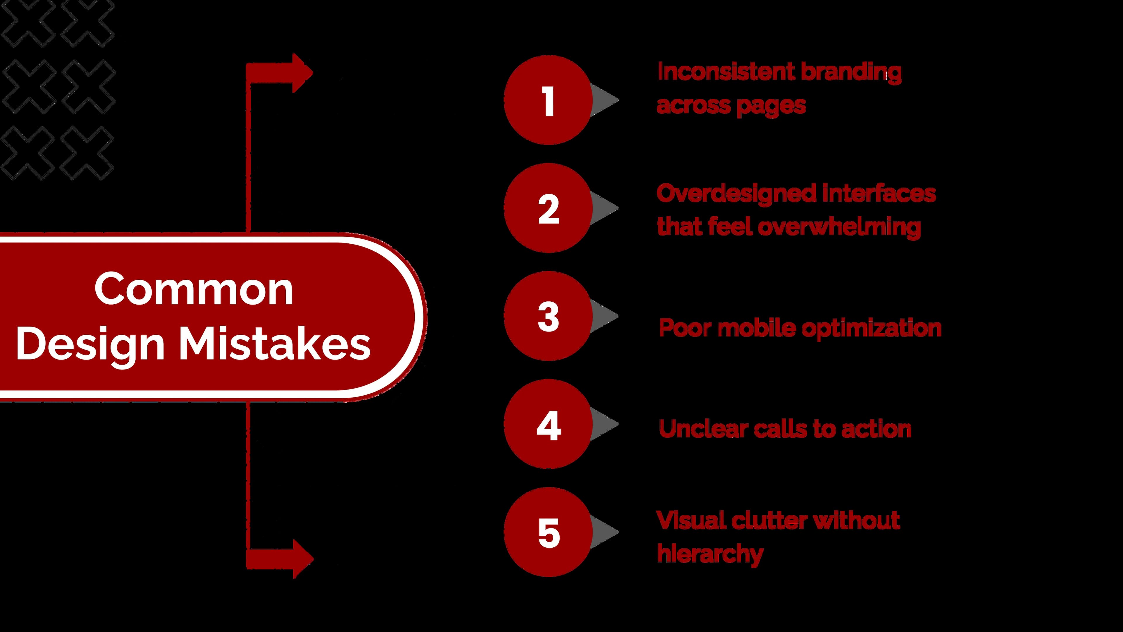
These issues may seem small internally, but users feel them immediately.
Designing Trust Is an Ongoing Commitment
Trust isn’t something we design once and forget.
As products evolve and audiences change, design must adapt. Continuous testing, refinement, and iteration are essential to maintaining credibility.
Designing trust means:
- Observing user behavior
- Identifying friction points
- Simplifying where confusion arises
- Staying consistent while evolving
Conclusion: Trust Is Experienced, Not Explained
Users rarely say, “I trust this design.”
They simply stay, engage, and take action.
When design works, trust feels effortless. When it doesn’t, no amount of persuasion can replace it.
Designing trust means respecting users’ time, attention, and expectations. It means clarity over cleverness, consistency over trends, and intention over decoration.
If your website looks good but isn’t performing, a stronger brand positioning strategy and refined user experience design might be what’s missing.
At Seven Koncepts, we help brands design experiences that feel credible, clear, and user-first - from visual identity to complete digital products. Let’s design trust into every interaction. Get in touch with Seven Koncepts today.
FAQs
1. Why is trust important in design?
Trust influences whether users stay, engage, and convert. Without it, even strong products struggle to succeed.
2. How does visual design build credibility?
Through consistency, clarity, typography, color, layout, and predictable interactions.
3. Why is visual branding important?
Visual branding is important because it shapes how people perceive and trust a brand before they read or interact with it. Elements like color, typography, layout, and imagery help communicate professionalism, consistency, and credibility. When visual branding is clear and consistent, it makes a brand easier to recognize, remember, and trust across all touchpoints.
4. Why are visuals important in marketing?
Visuals play a crucial role in marketing because they communicate messages faster than text and create emotional connections. In crowded digital spaces, visuals help capture attention, simplify complex ideas, and improve recall. Strong visuals also increase engagement, support storytelling, and make marketing messages more persuasive and memorable.
5. What are types of visuals?
Visuals in branding and marketing come in many forms, each serving a different purpose. Common types include logos and brand marks, typography and color systems, photography and illustrations, icons and infographics, videos and animations, and UI elements used in digital products. Together, these visuals work to create a cohesive and trustworthy brand experience.